How friendly is the site?
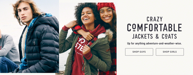
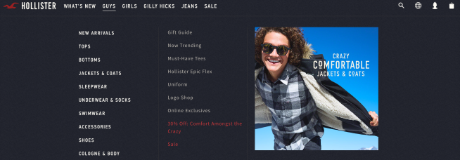
The Hollister website is very colorful, modern and transmits desire to keep browsing. When you get in the website, the first thing that appears is novel clothes and some models with these clothes. If you click on shop guys or shop girls it will take you directly to the clothes photographs. In the webpage header, it always appears the phrase “free delivery on orders over €50!”. This friendly welcome transmits good vibes and desire to continue looking the new garments.

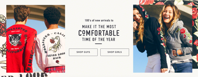
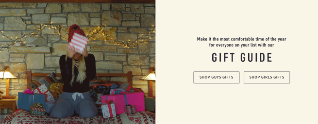
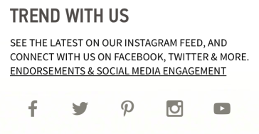
If you keep going down to the main page, you can see the same as on the first page but with another type of new products. Also, appear the options of shop guys and shop girls to make the purchase easier and faster. If you slide a little more down, you can see another section that is a gift guide because Christmas is coming and Hollister wants to help people with the purchase of gifts. Hollister invites you to visit their social networks, see the latest on their Instagram, and connect with them on Facebook, Twitter & more.
When you enter on the web the first thing is offered to you is to sign up for the newsletter and get 10% off in entire purchase. The products of this brand are completely for young people, but the middle-aged people also buy products as well.
The website is clear because it is well organized by sections. The colors of the web change depending on the seasons of the year. The colors that Hollister uses now are red, dark blue, dark green for Christmas.
Does it communicate everything it needs to?
The commercial purpose of Hollister is simple and visual because when you enter on the website you can see quickly that they are selling clothes for young people. It is known that it is for young people because of the models or, also, the prints or sentences that the clothing presents. They offer exclusive offers depending on the dates of the year but throughout the year there is a section of offers.
However, you can see clearly that the clothes are very youthful for the style that the brand follows. The colors that Hollister uses are flashy and cheerful. The lifestyle of the brand is cool.
From my point of view, the website is very effective because it covers the needs of customers. All sections are very well organized and the strategies to attract customers are well done. For example, the click of shop guys & shop girls that directly takes you to a next page with the product shown in the photograph.

How relevant is the content to your audience?
The content of the website is what young men and women are looking for because it is intended for them.
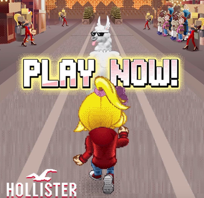
Hollister produces its own content, giving the brand more visibility and greater credibility. Each time the conten created by Hollister is more adapted to their target. For example, in Black Friday they created a computer game that consisted of picking up all the Hollister shopping bags without hitting the obstacles.
At the end of the page, there is information about the company. One of the information sections is about order help, shipping & handling, returns & exchanges. Another section is about the company and about the its privacy.
How beneficial is its interactivity?
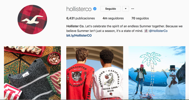
The interaction of the Hollister Instagram platform is very positive because they create interesting content and they receive many comments from their clients. In Instagram they have 4 million followers, which is a lot for a clothing store. In Instagram, they inform you about all the news and even always in all the photographs, it appears the price of each garment and this is very useful.
The information about the company and the contact, for example, to return a garment or to work with them, is at the bottom of the page. They also have an online chat.
The brand is interested in having your email to send you the newsletter and you are interested because when you give your mail you receive a 10% off for your next purchase.
What about navigation?
The structure of the page is very simple and all sections are ordered. Surfing in the website is not difficult because when you want to look for a particular item of clothing you just have to click on the drop-down menu and click on the product category. On the main page, there is also a search engine to make the search faster. If you want to return to the main page, it is as easy as clicking on the mark that is on the left.
Design quality?
The design of the website is done especially for the Hollister target and has a cozy style. The colors of the logo are red and the letters of Hollister in broken white. The page follows a very lineal style. In other words, it always appears text, photo, and the button to go directly to look at the clothes of the photos. The type of letters is correct along with the style that the brand follows.
Copy quality?
The content of Hollister website is understandable, close and educated. On the main page, the brand does not use many words because it is more visual to putting cheerful photographs. Every section is clear of what it is about and people do not feel confused when entering the website.
In each garment there is specified the material, how to wash it and the size guide.
Readability?
The typography of the Hollister website is always the same. The titles of the sections are written in capital letters and also in bold too. The most important words are put bigger than usual. The description of the products is long and the letters without bold.
Attention to detail?
Hollister really takes great care of content, design and language, everything has to be perfectly. They have everything very well thought out and detailed.
Credibility?
The content of the page is 100% credible and it is also totally safe to purchase. From my point of view, they don’t have errors in the website and in the shipments. The people around me are happy with the service and they have never had problems.
How good is the marketing?
Hollister marketing is very good because they do really good campaigns. They have done social campaigns for example by supporting the LGTB group and also a campaign against bullying. In the store, the clothes are strategically placed so that you have to move to the end of the aisle. On the other hand, they have a wide range of colors and that is why it is easy to find a garment with the color you want. It is a brand that is noticed because it does not want to be just a simple brand.
The branding?
Hollister is not just a brand because it is a lifestyle. It is a cool and fresh brand at the same time. Through this brand has been generated a very large community. People are passionate about mentioning the brand in their Instagram photos. Currently, the hashtag Hollister has been used 2,020,170 times.
Accessability?
The website is very functional and works perfectly. Since I am a regular customer and I have never had any problems.
Loading speed?
The loading of the webpage is fast so customers customers do not have to wait. It is a strong point because other web pages do not work well. Some pages of the competition have a low quality and design.
Use of multimedia?
The page is quite visual with some photographs accompanied by text. From my point of view, there should be a space dedicated to the social networks of the clients and post the most outstanding posts.
